| Thank you for Signing Up |
Quest 3 is an impressive leap in hardware, especially in the visual department, but it continues Meta’s tradition of building great hardware that feels held back by its software.
After months of teasing and leaks, Quest 3 is finally, officially, fully announced. Pre-orders start today at $500 and the headset ships on October 10th. While you can get the full specs and details right here, the overall summary is that the headset is an improvement over Quest 2 nearly across the board:
- Better lenses
- Better resolution
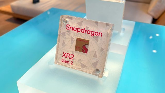
- Better processor
- Better audio
- Better passthrough
- Better controllers
- Better form-factor
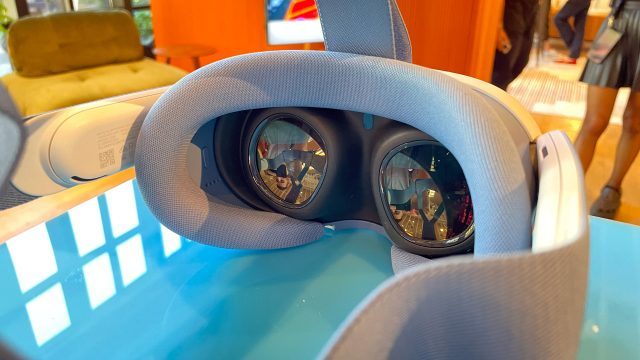
The improvements really add up. The biggest improvement is in the visuals, where Meta finally paired the impressive pancake optics from Quest Pro with a higher resolution display, resulting in a significantly sharper image than Quest 2 that has industry-leading clarity with regards to sweet spot, glare, and distortion.
Quest 3 has two LCD displays, giving it 4.6MP (2,064 × 2,208) resolution per-eye, compared to Quest 2 with 3.5MP (1,832 × 1,920) resolution per-eye. And even though that isn’t a massive leap in resolution, the upgraded lenses are so much sharper and it makes a huge difference compared to just the number of pixels.
Quest 3 also has an improved IPD (distance between your eyes) function and range. A dial on the headset gives it a continuous adjustment between 58–70mm. Given the eyebox of the optics, Meta officially says the headset is suitable for any IPD between 53–75mm. And because each eye has its own display, adjusting the IPD the the far edges doesn’t sacrifice any field-of-view.
Beyond the IPD upgrade, Quest 3 is the first Quest headset with an eye-relief adjustment, which allows you to move the lenses closer or further from your space. As a notched adjustment that can move between three different positions, it’s a little funky to adjust, but it’s a welcomed addition. Ostensibly this will make the headset more adjustable for glasses users, but as someone who tends to benefit from lower eye-relief, I hope that the nearest adjustment goes far enough.
Between the upgraded IPD adjustment and eye-relief, Quest 3 is the most adjustable Quest headset so far, which means more people can dial into the optimal optical position.
Holistically speaking, Quest 3 has the best display system of any headset on the market to date.
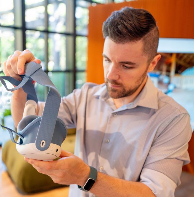
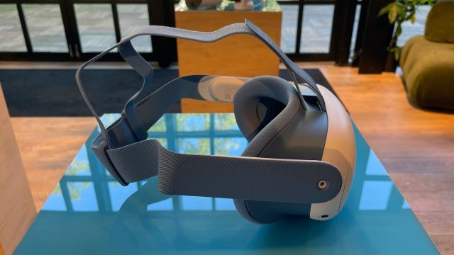
The only major things that haven’t improved over Quest 2 are the default headstrap, battery life, and weight, which are all about the same. The biggest benefit of the new optics is their performance, but their more compact form also means the weight of the headset sits a little closer to your face which makes it feel a little lighter and less bulky.
Powered Up
When Quest 3 is firing on all cylinders—including software that’s well-optimized for its performance envelope—you’ll wonder how you ever got by with the visuals afforded by Quest 2.
Take Red Matter 2, for instance, which was already one of the best-looking games on Quest 2. Developer Vertical Robot put together a demo app, which lets you instantly switch back and forth between the game’s Quest 2 visuals and newly enhanced Quest 3 visuals, and the difference is staggering. This video gives an idea but doesn’t quite show the full impact of the visual improvements that you feel in the headset itself:
Not only are textures significantly sharper, the extra processing power also allowed the developers to add high-resolution real-time shadows which make a big difference to how grounded the virtual world feels around you.
However, the exceptionally well-optimized Red Matter 2 is a rare exception compared most apps available on the platform. Walking Dead: Saints & Sinners, for instance, looks better on Quest 3… but still pretty rough with blotchy textures and shimmering aliased shadows.
And this was an example that Meta specifically showed to highlight Quest 3’s improved processing power…. And yes, the Walking Dead example shows that the developers used some of the extra power to put more enemies on screen. But the question here is, what good is a phone call if you are unable to speak what good is better optical performance if the textures aren’t matching them in the first place?
So while Quest 3 offers the potential for significantly improved visuals, the reality is that many apps on the platform won’t benefit as much from it as they could, especially in the near-term as developers continue to prioritize optimizing their games for Quest 2 because it will have the larger customer base for quite some time. Optimization (or lack thereof) is a systemic issue that is more complicated to address than just ‘throw more processing power at it’.
But as we all know, graphics aren’t everything. Some of the most fun games on the Quest platform aren’t the best looking out there.
But when I say that software is holding back the headset, more than half of that sentiment is driven not by the visuals of apps and games, but by the headset’s overall UI/UX.
This applies to all Quest headsets, of course, but the platform’s obtuse and often buggy interface hasn’t seen the same kind of consistent improvements that the hardware itself has seen from Quest 1 to Quest 3—which is a shame. The friction between a player’s idea of wanting to do something in the headset and how seamless (or not) it is to put on the headset and do that thing is deeply connected to how often and how long they’ll actually enjoy using the headset.
Meta has given no indication that it even acknowledges the deficiency of the Quest UI/UX. With the release of Quest 3, on the interface specifically, it doesn’t seem like it will make any meaningful changes on that front. In terms of UX at least, there’s two general improvements:
Passthrough
Quest 3’s passthrough view is a big leap over the low-res black-and-white passthrough of Quest 2. Now with full color and higher resolution, passthrough on Quest 3 feels more like something you can use all the time (granted, I haven’t had enough time with the headset to tell if the passthrough latency is low enough to prevent motion discomfort over long periods, which was a problem for me on Quest Pro).
And while it isn’t clear to me if the software will enable passthrough by default (as it should), being able to easily see a reasonably high quality view outside of the headset is a notable UX improvement.
Not only does it make users feel less disconnected from their environment when putting on the headset (until they’re actually ready to be immersed in the content of their choice), it also makes it easier to glance at the real world without removing the headset entirely. That’s useful for talking to someone else in the room or looking to make sure a pet (or child) hasn’t walked into your playspace.
I was surprised to see that with the newly added depth sensor there’s still warping around your hands, but overall the passthrough image is much sharper and has better dynamic range. Unlike Quest Pro, I was able to at least roughly read the time and some notifications on my phone—an important part of not feeling completely disconnected from the world outside the headset.
This also opens the door to improving the flow of putting on the headset in the first place; if passthrough is enabled by default, Meta should encourage users to put on the headset first, then find their controllers (instead of awkwardly trying to fit the headset with controllers already in their hands). And when the session is over, hopefully they turn on passthrough and instruct people to put down their controllers first, then remove the headset. These are the kinds of UX details the company tends to miss entirely… but we’ll see.
The other real UX improvement coming with Quest 3 could be automatic room scanning, which automatically creates a playspace boundary for users instead of making them create their own. I say “could be” because I didn’t have enough time in my hands-on with this feature to tell how quickly and reliably it works. More testing to come.
Similar to implementations we’ve seen on other headsets, the room scanning feature encourages users to look around their space, giving the headset time to build a map of the geometry in the room. With enough of the space scanned, a playspace boundary will be created. The same system can also be used to establish the position of walls, floors, and other geometry that can be used in mixed reality applications.
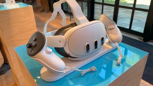
Also worth mentioning is the optional (and fairly expensive) official Quest 3 dock. Keeping the headset and controllers powered, updated, and ready to go is a big challenge when it comes to VR friction. Having a dedicated place to put your headset and controllers that also charges them is definitely a boon to the UX.
This feels like something that should really be part of the package, but you’ll have to pay an extra $130 for the privilege. Hopefully we’ll see more affordable Quest 3 docks from third-parties in the near future.
Continue on Page 2: Marketing Reality »
Source: Read Full Article


